Join 400,000+ professionals in our courses here 👉
https://link.xelplus.com/yt-d-all-coursesDiscover how to create dynamic column charts in Excel that automatically update colors based on data changes. This tutorial is perfect for anyone looking to enhance their Excel skills, especially in visually representing sales data. Here's a quick overview of what you'll learn:
⬇️ Grab the workbook from here:
https://pages.xelplus.com/variance-chart-fileDynamic Color Coding: Learn how to set up Excel so that positive changes in data are shown in green and negative changes in red, without manually coloring each data point.
Synchronized Sales Data Charts: Find out how to display actual sales data alongside the change from the previous year, with both charts perfectly aligned for easy comparison.
Step-by-Step Guide: Follow clear, easy steps to set up your charts from scratch, including removing unnecessary elements for a clean, professional look.
🎓 Get access to the complete Excel Dashboard Course:
https://www.xelplus.com/course/excel-dashboards/Colorful Data Labels: Not just the bars, but also learn how to change the color of the data labels based on their position relative to the axis.
Conditional Formatting of Charts: Master the art of conditional formatting within charts to make your data more insightful and visually appealing.
Custom Number Formatting: Dive into custom number formatting to control the display and color of your numbers directly in Excel cells.
Practical Examples: Watch as we demonstrate these techniques using actual sales data, making it easier for you to apply these skills in real-world scenarios.
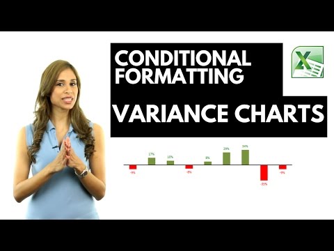
In this video I show you how you can use conditional formatting in Excel Column or Excel Bar charts.
I also show you how you can conditionally format the data labels in Excel graphs to show a different color if the values are positive to when the values are negative.
The technique in the video shows a variance column chart but it works in the same way for a bar chart.
This technique works for Excel 2010, Excel 2013 and Excel 2016. For Excel 2007 and below, you need to use a different technique. You will need to create two additional series, one for positive number and another for negative numbers and format each series accordingly - and also overlap these by 100%.
Part 2 - Better Variance charts
https://youtu.be/73s3qej4vi0Part 3 - Arrow Variance Chart
https://youtu.be/-wYJdbb8-0Y★ My Online Excel Courses
https://www.xelplus.com/courses/➡️ Join this channel to get access to perks:
https://www.youtube.com/channel/UCJtUOos_MwJa_Ewii-R3cJA/join👕☕ Get the Official XelPlus MERCH:
https://xelplus.creator-spring.com/🎓 Not sure which of my Excel courses fits best for you? Take the quiz:
https://www.xelplus.com/course-quiz/🎥 RESOURCES I recommend:
https://www.xelplus.com/resources/🚩Let’s connect on social:
Instagram:
https://www.instagram.com/lgharani LinkedIn:
https://www.linkedin.com/company/xelplusNote: This description contains affiliate links, which means at no additional cost to you, we will receive a small commission if you make a purchase using the links. This helps support the channel and allows us to continue to make videos like this. Thank you for your support!
#excel
About the Site 🌐
This site provides links to random videos hosted at YouTube, with the emphasis on random. 🎥
Origins of the Idea 🌱
The original idea for this site stemmed from the need to benchmark the popularity of a video against the general population of YouTube videos. 🧠
Challenges Faced 🤔
Obtaining a large sample of videos was crucial for accurate ranking, but YouTube lacks a direct method to gather random video IDs.
Even searching for random strings on YouTube doesn't yield truly random results, complicating the process further. 🔍
Creating Truly Random Links 🛠️
The YouTube API offers additional functions enabling the discovery of more random videos. Through inventive techniques and a touch of space-time manipulation, we've achieved a process yielding nearly 100% random links to YouTube videos.
About YouTube 📺
YouTube, an American video-sharing website based in San Bruno, California, offers a diverse range of user-generated and corporate media content. 🌟
Content and Users 🎵
Users can upload, view, rate, share, and comment on videos, with content spanning video clips, music videos, live streams, and more.
While most content is uploaded by individuals, media corporations like CBS and the BBC also contribute. Unregistered users can watch videos, while registered users enjoy additional privileges such as uploading unlimited videos and adding comments.
Monetization and Impact 🤑
YouTube and creators earn revenue through Google AdSense, with most videos free to view. Premium channels and subscription services like YouTube Music and YouTube Premium offer ad-free streaming.
As of February 2017, over 400 hours of content were uploaded to YouTube every minute, with the site ranking as the second-most popular globally. By May 2019, this figure exceeded 500 hours per minute. 📈
List of ours generators⚡
Random YouTube Videos Generator
Random Film and Animation Video Generator
Random Autos and Vehicles Video Generator
Random Music Video Generator
Random Pets and Animals Video Generator
Random Sports Video Generator
Random Travel and Events Video Generator
Random Gaming Video Generator
Random People and Blogs Video Generator
Random Comedy Video Generator
Random Entertainment Video Generator
Random News and Politics Video Generator
Random Howto and Style Video Generator
Random Education Video Generator
Random Science and Technology Video Generator
Random Nonprofits and Activism Video Generator